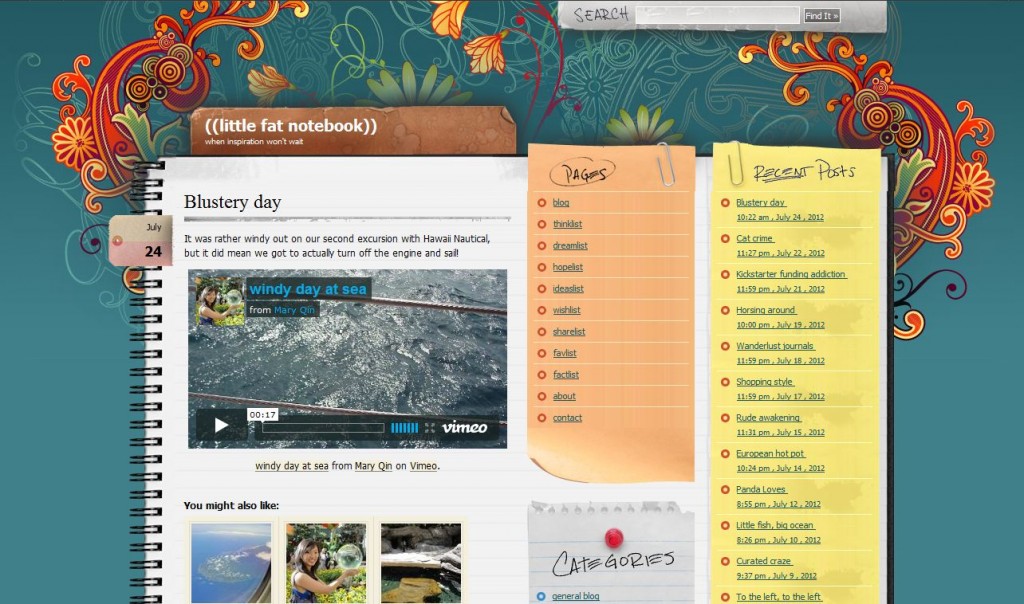
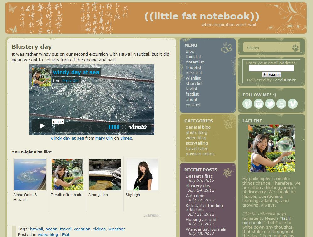
Yesterday I finally decided it was time to update my blog’s look since it’s been two or three years and my needs have changed. While my old theme served me well, I wanted some different features. For one, I wanted my intro section to be above the fold. Additionally, I wanted the subscription box to be visible above the fold too. I planned on adding a “Follow Me” section with icons linking to my profiles on social media sites, but that wouldn’t be immediately apparent on the old theme. Other than that, I wanted a similar three-column layout with nice use of colors, but something a little less flashy.
So here’s how my blog looked before and after the changes:
As you can see, there’s more width in the blog post section to allow for larger pictures and videos. You also get more content above the fold since the lists are more condensed vertically. Finally, it’s much easier to see who I am, how to subscribe to the blog, and where to find me on other sites! I’m quite pleased and I’m sure this theme will last me a few more years.


