I just got around to upgrading my phone to iOS 9 today and there were some surprises in store for me! First was the new font, which is a bit… cuter, I’d say. It’s hard to describe but I feel like it’s a bit thinner, more rounded, and seems slightly more spaced out. Most people probably won’t even notice it.
The biggest shock was when the keyboard popped up and *gasp* there were lowercase letters! This seemed like such a basic thing, yet it took years to finally get it. In fact, I’ve already converted to Swiftkey as my default keyboard because the Apple one just doesn’t cut it.
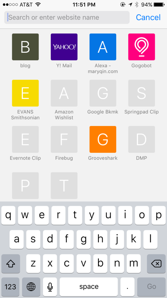
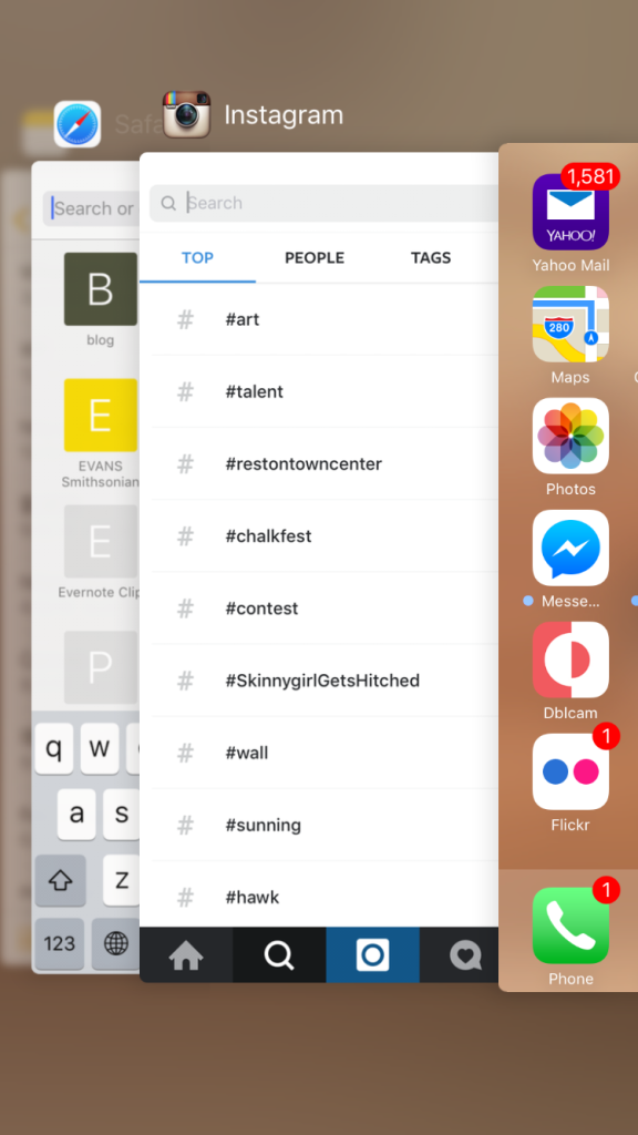
As you might also note from here, Safari bookmarks now show a letter when there’s no custom icon from the site. Previously, they used the Safari compass icon as a placeholder.

Switching between apps takes on a new feel as you swipe in the opposite direction now. It glides more but I find it harder to close two apps at once.

Menu box pop-ups feel rounder and more spaced out.

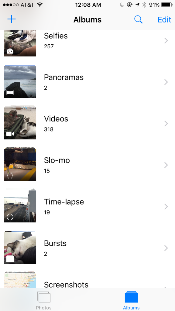
New default photo folders group together “Selfies” and “Screenshots”

Photos have a scrubber at the bottom, where you can quickly navigate through.
Other nice updates allow you to zoom on videos to get a better view, quickly select a bunch of photos by swiping across them (no more individual taps!), and swipe down on a photo to go back to the thumbnail view of an album.

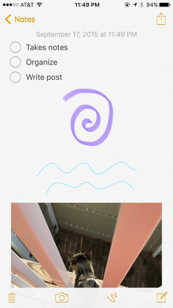
Notes gets a lot more functionality, with the ability to create checklists, draw sketches, and insert photos.
Notes can also be put into folders, making it easier to organize.

Now easily add a webpage to your notes too!

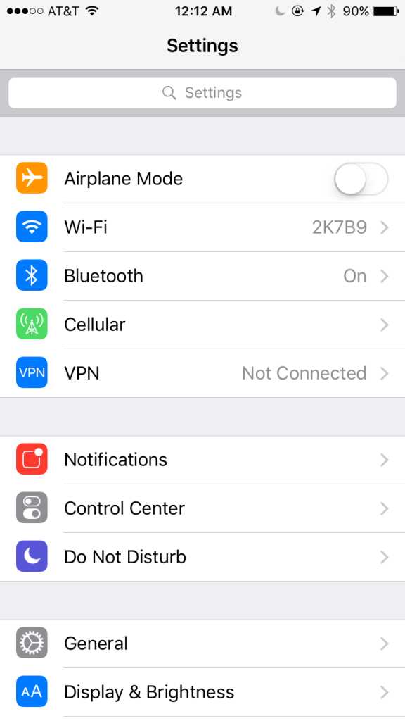
Search within settings when you can’t remember where something like battery usage would be found (don’t we all have trouble with this?)

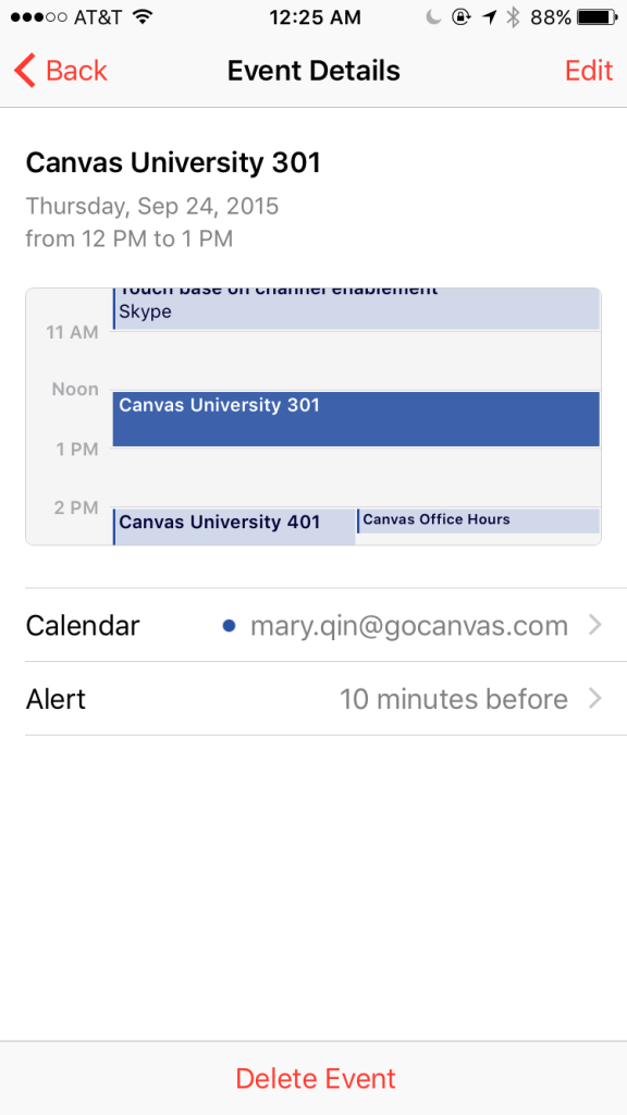
Viewing events in Calendar show you a glimpse of your time before and after the event.

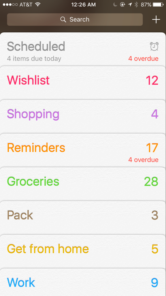
Reminders have nice summaries of how many items are in each list and which of those are overdue.

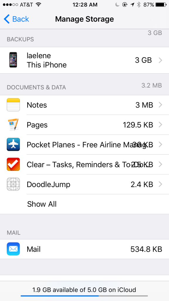
Sometimes text runs into each other though.
And then of course there are plenty of other changes that you probably heard about as well:
-directions for public transit in select cities
-smarter prompts from Siri: swiping right from the home screen pulls up suggestions for contacts, calendar events, apps, and more
-“Back to [previous app]” option in the top left now lets you quickly return to the app you just came from
-Low power setting to conserve your phone’s power usage
-Improvements to performance so battery life is extended
-Passbook is now Wallet and you’ll be able to add loyalty cards in addition to other forms of digital cards/tickets
-A News app for aggregating news that you might want to read
-“Remind me of this” prompts Siri to set up a reminder about whatever you are looking at
-Add attachments in Mail – not just for photos anymore!
So far I’m really liking the changes and I look forward to stumbling upon others that make the experience better in subtle ways. I’m not upgrading my iPad mini just yet because a coworkers told us that the version of Reflector we use isn’t compatible with it. I need to be able to show my tablet screen for demos and webinars and I’m not keen on paying for the newer version of the software just so I can have iOS 9 on my tablet. Have you upgraded to this new operating system? What do you think so far?

