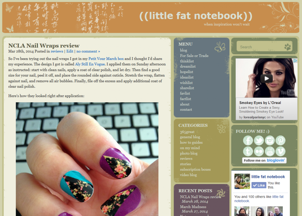
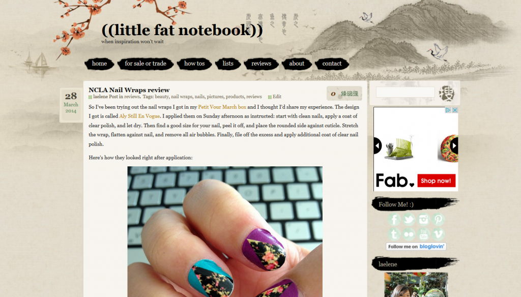
It’s time for a change again. I decided this morning that I needed to update my blog theme so I could make use of a horizontal menu bar again. While I enjoyed the look of the theme I was using, it wasn’t working the way I want it to anymore. How I manage the blog evolves all the time, and so the look and organization of it gets an overhaul too. The next time I make a change, it’ll probably be to allow dropdown menus, but for now the single menu bar approach will work just fine.
This new look will hopefully make it easier to find my FSOT page and key categories like “how tos” and “reviews.” I also like some of the flourishes, like that super cool tiger image that makes up the comment box and the pretty Japanese kanji sprinkled throughout. I played around with the stylesheet a bit so it’s more customized for me (mainly just made the link color more visible in the post, since it was hard to tell any text was a link before). One of these days I really need to learn CSS so I can be more versatile in my editing. And when I really feel like treating myself, I’m totally getting a custom theme created. One day…


