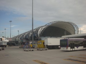
Bangkok Airport: it's like a robot caterpillar.
It first occurred to me as the bus was pulling away from the airport in Bangkok that it made no sense why the departure gates are so nice and up top whereas the arrival gates are given basement levels and dungeon treatment. I was staring at its unique architecture and thinking of how high the ceilings in the departure area are, getting the bulk of the natural lighting. Then I thought about the grungy ground floor that I had just left, where everything was darker and grimier. It had never hit me before, but suddenly I wondered: is this the first impression that a country or city wants to give to visitors? Sure, I walked through some nice areas to get out of the airport, but in making departing so scenic an experience, are you trying to encourage people to leave? Besides, the people in departure have seen your city already; they hardly need to see highlights of it. Rather, it’s the people arriving who should get a glimpse of everything you have to offer.
So here’s how I envision it: people fly in from around the world to your airport, where they see some of the finest architecture you are capable of, preferably with some local flair or at least a memorable look and feel. They disembark and take an escalator up to the top floor, where sunlight flows in during the day and stars twinkle overhead at night. Along their walk they pass art that exemplifies what your city, your country is all about and get to see some mini models of cool buildings they’ll find, as well as some static scenes of what local life is or was like. Already they can smell the food your town has to offer and envision the bustle or peacefulness of your streets. Meanwhile, as they look around outside the terminal, they are offered beautiful views of the surrounding area, whether it’s the ocean water or city lights shining in the distance.
The anticipation builds as they approach immigration, where TVs depict highlights of what they can find after they set foot outside. As they wait in line, colorful images catch their attention and useful subtitling leave them scribbling notes on what amazing things they want to check out there. By the time they reach the immigration official, they are so engrossed in the videos that they hardly want to leave. Officials are dressed in native attire and all wear a smile on their face as they greet you. Though they take their roles seriously and carefully check your documents, they do so with a pleasant demeanor and welcome you to their city the moment you pass. If you don’t, they politely direct you to wherever you need to go to be checked out further. From there, they apologize for the inconvenience and allow you through or detain you because you really are a threat.
Carts are strategically placed beyond the immigration line so you’ll be prepared as soon as you get to the appropriate conveyor belt. You can watch as the luggage is loaded from the truck to the conveyor belt outside, then taken up to where you are standing. As you search for your belongings, you can distract yourself with spectacular views of planes taking off or landing, as well as enjoy the scenery and continue to watch those videos about the sights and sounds of the city they’re about to experience. The moment they have all their belongings and clear customs, they are greeted with a bright lobby complete with free maps, information on the special concessions available for tourists, and the typical money exchange, bank, ATMs, hotel/tour/taxi bookings, and information centers. For those being picked up, glass doors allow both sides to locate their parties upon approach, so they know exactly where to head to (rather than scanning the crowd trying to figure out where to go) as soon as they exit. For the others, signs clearly point the way to the various forms of transportation offered from the airport and ticketing stands are located near pick-up locations or along the way to getting to the bus, train, shuttle, or what have you.

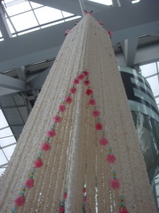
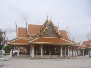
They should have had this in arrival! I saw plenty of mini versions throughout Bangkok.
Small touches add a local flair to the decor, from things like the design of the door handles to the decorations spicing up the space. Murals show off the most popular attractions and display cases offer a preview of the cool things you can buy, do, or see. A few small stores offer items for sale, just in case a visitor doesn’t want to have to track down an item they like somewhere in the city. A couple of convenience stores and cafes allow a weary traveler to get a quick pick-me-up before the typically half-hour to hour drive to get into the city, or wherever their destination may be. If possible, the bank on site would stay open all night, in case flights came in late and people missed their chance to withdraw money (and couldn’t through an ATM). All ATMs would certainly be operating 24 hours a day.
As for the departure terminal, well, it would be below the arrivals and get less light. However, it would be brightly lit and decorated with the top attractions that visitors and locals alike should have seen, as a reminder of the beauty of the city they’re leaving. There would be messages all around inviting them to return soon and thanking them for stopping by. After checking in and going through security, they’d walk past all the duty free shops as we do now. Some restaurants would line the outer edge of the terminal with clear views of the runways. All the waiting areas for the gates would also offer a look towards the flights arriving and departing. When it comes time for boarding, stairs, escalators, ramps, and elevators would allow access to the floor where the ramp to the airplane is. Actually, some places function like this already (so what does their arrival terminal look like?).
This plan may not be practical, but it would be nice if they at least put more welcoming decorations in arrivals. This idea was reemphasized when I saw all the cool things they had in departures as I was leaving. I’m sure having a more inviting arrival terminal would make us all feel more welcome, whether we’re coming for the first time or coming home.


