The first half of 2021 was full of rebrands for companies that I use/buy from. I found this interesting, so here’s a look back at the changes that had occurred, as it seemed like suddenly all the companies I was aware of decided to refresh their look and missions:
old logo 
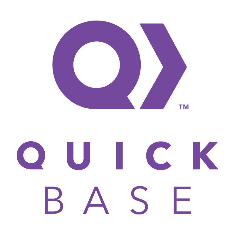
new logo
The entire color scheme changed with this rebrand and everything felt a little retro. The pixelated logo is reminiscent of 8-bit graphics and the colors are a throwback to the 70’s, especially if you go to their website. They also changed the styling of their name from Quick Base to quickbase or Quickbase. My favorite color is purple, so I was sad to see the change, but it did mean a pretty cool new cream hoodie, camper mug, and white water bottle that were available at the 2021 Empower Conference.
CAUSEBOX –> Alltrue, May 18 2021
causebox logo 
alltrue logo & flag 
alltrue font
This was a pretty major overhaul, with a completely different name in addition to a new font and color scheme. The choices here also remind me of Quickbase’s, with pastel colors and a move away from all caps. I like the color scheme here, which is softer and includes my favorite with shades of purple. The products they provide are as great as ever and I’m a happy subscriber who often wishes this was bimonthly instead of quarterly, because I’d love to get them more often!
old logo 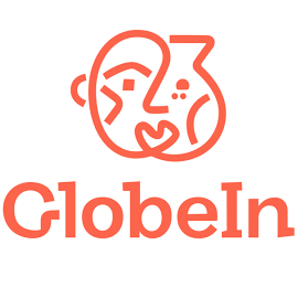
new logo
I like the new boldness of GlobeIn’s change. They sort of did the opposite of the prior companies (particuarly Quickbase) and went from a softer palette to a bright, vibrant one. Their logo is spunky and does remind me of the products that you get from their boxes. I like that it’s also a reminder of the people behind the products, which is a big part of their marketplace.
The Grommet –> Grommet, June 27 2021
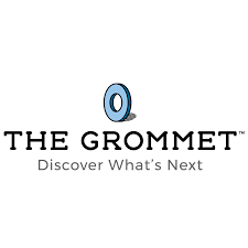
old logo 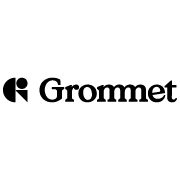
new logo
Some versions of the old logo have even more stuff on it, so it’s nice that they chose to simplify. Now it’s very bold and geometric. The connected m’s make it a unique look. They also went for a flatter, bold look like GlobeIn. And they seem to be dropping the “the” from their name and refer to themselves as just Grommet now.
All in all, I like the rebrands, though I’ve always been a person who enjoys change and something different. It’s interesting to see two of the brands choose to go pastel with cute serif fonts while the other two went bold with stronger, cleaner lines. What do you think of each of their choices?