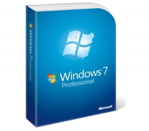
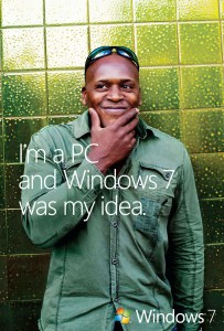
 Microsoft has been working really hard to promote their newest operating system with their “Windows 7 was my idea” campaign. Though I think they’re trying too hard to some extent, I think their efforts are catchy enough to be interesting. In fact, that phrase really does hit on how many people must feel about the product. No doubt plenty of people look at the new features and think, “I totally thought of that!” And indeed, the combined wisdom of Windows users is something not to be overlooked. Certainly their suggestions were instrumental in the changes made for Windows 7.
I just got Windows 7 installed on my computer last night, thanks to Doc, who trekked out to Panda’s place to help me out. Opti kindly allowed us to use two of her CD/DVD-Rs so I could boot the new operating system from an external source. Thank goodness we had two, since the first disc Doc burned didn’t work! After many hours waiting for my computer to do its thing and process whatever it needed to, I was finally able to boot with my brand new system. Gotta love that Panda’s an engineer who gets access to a free version of Windows 7 Professional, courtesy UCLA.
 Now that I’ve been using it for a couple of hours and have viewed the tutorial videos, I’m getting a good handle on its new features. One of my favorites is the rotating backgrounds, which makes so much more exciting. I’ve set my desktop background to change every 10 minutes, just to keep things fresh. It’s also so much nicer to scroll your mouse over things and get previews popping up before you commit to clicking. I kind of miss the long task bar buttons that would have the icon and first couple of words for each program you had open, but I’m getting used to remembering what each icon stands for (and I could always revert back to what I’m used to if it gets too confusing). Another thing is that the quick launch icons are gone and now any of the programs can be “pinned” to your task bar quickly and easily. They basically took the quick launch and made it the task bar, but also allow you to open up the open windows of a program using the same icon you use to open up the program in the first place. If that makes any sense.
One of the things I remember hearing about before the release of Windows 7 is the “clicking” into place. Whenever you drag a window to the left or right side of the screen and your mouse hits the edge of the screen, the window automatically resizes to fit the corresponding half of the screen. Saves me the work of resizing windows that they take up about half the screen whenever I want to see the contents of two windows at the same time. I think that’s a key feature that makes everyone exclaim, “I’ve wanted that forever!” They’re also much better with docking windows to the edges of your screen so you don’t have to approximate anymore.
Check out the cute little hummingbird!
The new library feature is something that will take some getting used to, since it’s another way of organizing things. From what I gather, it will be very useful because it allows you to group folders together without actually moving them into the same parent folder together. That way, you can access certain files across all of your documents, pictures, or videos and easily search within these libraries that you create and define. The preset ones are pretty intuitive too: Documents, Music, Pictures, and Videos. Sometimes I have videos that are actually in folders within my Pictures folder, so having a Video Library makes it easier to find the videos I’m looking for without having to search all over the place. Another thing is, I can add an external hard drive folder to the library so that when it’s connected, the library will access the files in my other hard drive as well. Nice!
Seems like Microsoft is making a nice step towards better usability and functionality. I don’t believe that the Mac commercial poking fun at Microsoft is true at all. Sure, there may have been some empty promises in previous operating systems, but I never felt they were that bad. And even if they were, Windows 7 is truly a huge improvement. Besides, I don’t respect Apple for making a series of commercials where they just ridicule their competitor. Whether or not what they say is true, it’s unsportsmanlike to say it at all. If they are really that great, then they’d be just fine touting their strengths without stomping all over Windows. Yet another reason why I’m not a Mac person. But anyway, like I was saying, I think Microsoft’s done well with this new operating system and the corresponding marketing campaign.


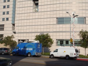




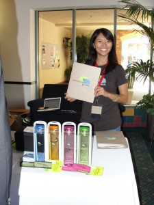
 It’s been a long and exhausting weekend for us at Opportunity Green, as we worked long and hard to throw a fantastic conference for everyone. A lot of lessons have been learned on my end, watching how the intensely crazy registration panned out for us and getting a behind-the-scenes look at how things were running. We didn’t expect so many people to show up to the event, so it was challenging to handle the overload in capacity, but it’s great that we got so many interested people to attend. All in all I had a rewarding experience, getting great feedback from participants who were so thankful and appreciative!